Matcha Haven
A calm and modern tea brand inspired by Japanese tea culture. Designed the full brand identity and packaging system to create a gentle, natural and consistent visual experience.

Overview
Matcha Haven is a calm and modern tea brand shaped by the quiet warmth of Japanese tea culture. The project focuses on creating an identity and packaging system that feels natural, authentic and quietly traditional. The aim was to design something familiar and comforting, the kind of presence that reminds you of home even when you are far from it.

Brand Concept
The direction began with small, meaningful details from tea rituals. I explored the simple forms of the tea bowl, the leaf and the soft flow of preparation. These elements shaped the logo into a clean bowl and leaf symbol that feels minimal yet rooted in the origins of matcha. It reflects purity and care without adding unnecessary complexity. Every part of the identity follows the same intention and stays clear, calm and thoughtfully arranged.
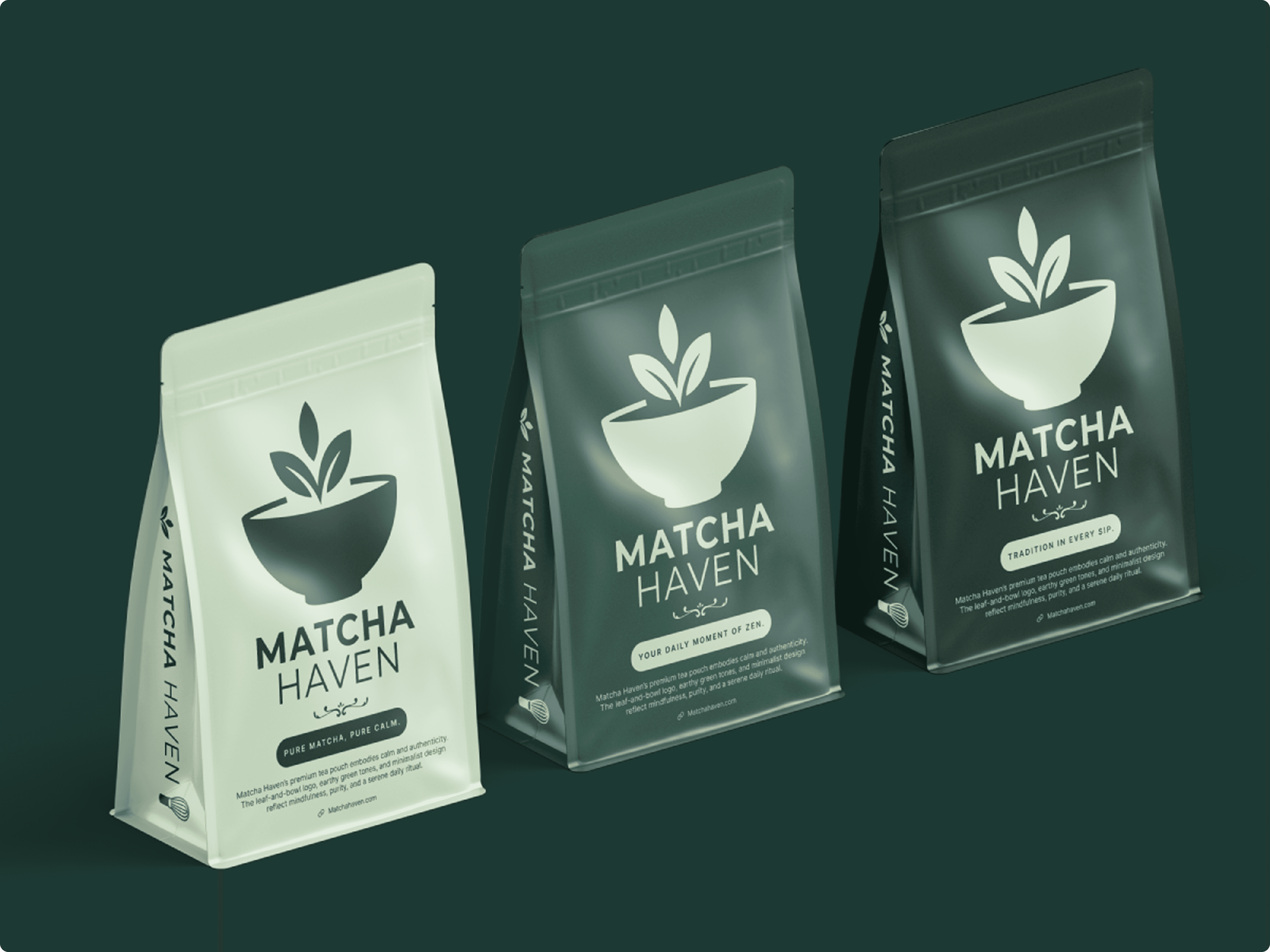
Packaging System
The packaging was designed to look fresh, approachable and consistent across different product types. Each piece follows a simple structure that highlights the brand’s minimal character. The hierarchy stays clear and the visuals remain uncluttered. Whether it is a pouch, a sachet or a cup, the system adapts naturally and leaves room for the brand to expand into new flavors or formats without losing its voice. This flexibility makes the identity feel reliable and long lasting.

Visual Language
The visual style is built around feeling rather than strict rules. Calm greens create a gentle presence that reflects the natural character of matcha. A deeper tone adds a sense of premium warmth while keeping everything soft and grounded. Typography is open and modern, giving the layouts a relaxed flow. Clean spacing and simple forms help the identity feel peaceful, familiar and easy to connect with.

Lifestyle Moments
The brand was placed into soft and familiar settings that reflect the gentle rhythm of tea culture. Scenes with warm lighting, natural textures and simple objects help the identity feel grounded and homely. It is not just a drink. It is a small ritual of calm, something natural and comforting that carries a hint of tradition with it.

Outcome
Matcha Haven became an exploration of how a simple idea can shape an entire visual experience. It strengthened my approach to building identity systems that stay clear across packaging and lifestyle applications. The final direction brings together culture and modern design in a way that feels gentle, familiar and quietly expressive.